
This project was a concept study focused on exploring the interface design for a music app and its accompanying web landing page.
The aim was to design a clean, modern, and emotionally expressive UI that captures the energy and personality of the brand. The design intended to feel immersive and vibrant, an experience tuned to the rhythm and sensibilities of a young, music-loving audience.


-
Visual hierarchy and readability
-
Strengthen brand alignment through color and typography
-
Create a polished, modern aesthetic
-
Ensure accessibility with contrast and clarity

I explored visual inspiration from music apps like Spotify, Tidal, and Apple Music, but focused on creating something more visually expressive and neon-inspired. I built a moodboard around themes like:
-
Neon nightlife
-
Rhythmic motion
-
Dark UI with glowing gradients
This direction informed the deep purple and magenta palette, bold sans-serif typography, and a focus on visual rhythm and movement.


First Exploration
-
Tried a heavy dark UI with minimal glow.
-
Felt too flat and lacked emotion.
Second Iteration
-
Introduced vibrant gradients and glow effects.
-
Refined typography hierarchy for readability.
Final Design
-
Settled on deep purples, magenta-pink gradients, and neon highlights.
-
Used circular, playful buttons and dynamic visuals to express motion and music.


-
Typography: Modern sans-serif (likely Inter or Montserrat), bold for headers, medium for body.
-
Color Palette:
-
Primary: #8B00FF (neon purple), #FF007A (magenta pink)
-
Secondary: Black, white, deep violet gradients
-
-
Components:
-
Rounded buttons with gradients
-
Smooth cards with shadow depth
-
Custom player UI with vibrant visual feedback
-


Cards:
-
Feature cards → Top of the hierarchy
Good for the user: They don’t have to guess what’s trending or recommended, it’s seen immediately.
-
Playlist cards → Mid-level emphasis
Good for the user: Helps them browse and discover without overwhelming them.
-
Track cards (row cards) → Functional depth
Good for the user: Supports efficient scanning and decision-making in lists or search results, where speed and clarity matter most.
-
Mini cards → Lowest hierarchy, supportive (for example widgets)
Good for the user: Useful when attention is limited, quick recognition without clutter. It improves the experience without distracting from the primary flow.
Card Variants Mapped to User Tasks
1. Feature card → Discover
-
User task: Show me something new or important.
-
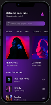
Example: “R&B Playlist” hero section.
-
Why this works: Large visuals + clear play button capture attention quickly, making it easy for users to start listening without thinking too much.
2. Playlist card → Browse
-
User task: Let me explore options and pick what fits my mood.
-
Example: “Daily Mix,” “R&B Playlist” (in Recent).
-
Why this works: Mid-size visuals allow scanning multiple playlists side by side, supporting browsing and comparison.
3. Track card (row card) → Select / Manage
-
User task: I know what I want. Let me find, play, or favorite it.
-
Example: Track rows like Blinding Lights, Zombie.
-
Why this works: Compact, info-rich rows are efficient for detailed tasks: scanning titles, checking durations, adding to a queue, or liking a song.
4. Mini card → Suggest
-
User task: Give me quick ideas, but don’t interrupt me.
-
Example: Could be “suggested tracks” in a horizontal carousel.
-
Why this works: Small footprint means they can live in secondary spaces (sidebars, widgets, end-of-list prompts) without cluttering.

Why this mapping matters
-
It aligns UI structure → user intention.
-
Each card becomes a tool for a specific goal:
- Discover → Feature
- Browse → Playlist
- Select/Manage → Track
- Suggest → Mini
-
Users move fluidly between modes: from discovery (big and bold), to browsing (medium scan), to precise selection (rows) , to optional suggestions (compact).

This project allowed me to combine strong visual storytelling with clean UI principles. The final result feels immersive, emotional, and visually distinct, capturing the vibe of music itself.
-
Elevated the visual identity with bold color and photography
-
Created a cohesive experience across web and mobile
-
Delivered a UI that feels alive, expressive, and true to the brand’s voice